How to set up riso files

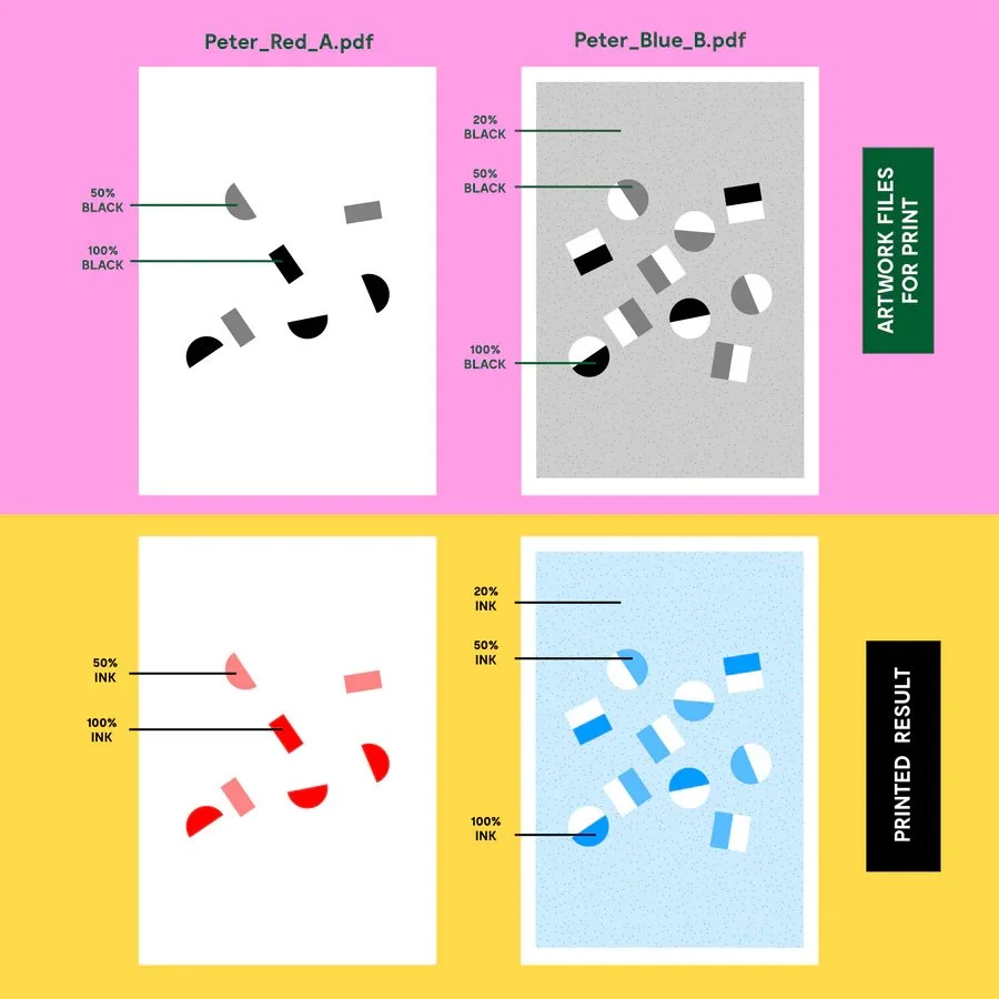
Riso uses grayscale to determine the ink opacity of each color, so 100% black in the file will print solid 100% red. 50% will print 50% light red and so on. These layers can overlap to create different colors as well. (They inks will mix together if you have them overlap.) Seen on the right ->
One way to format a file is to set up a layer where you’ll only be working in grayscale. This layer will be set to ‘multiply’ to imitate how inks will overlap over each other. Above this add another layer that will clip down the the first one and fill this layer with your desired ink color. Set this layer to ‘screen,’ this will now show you how the ink might look when printed! Repeat this with the rest of the color layers you want to work with.
An example of this type of file set-up below, as well as the finished product. (If you’d like to just work with colors by the layer and skip working in greyscale, that’s totally fine— I can convert and adjust them to greyscale.)

Please try to keep prints under 4 colors!
Any more than that and the tires that feed the paper through have a higher chance of leaving tire marks on the print.
Firstly, what is Riso?
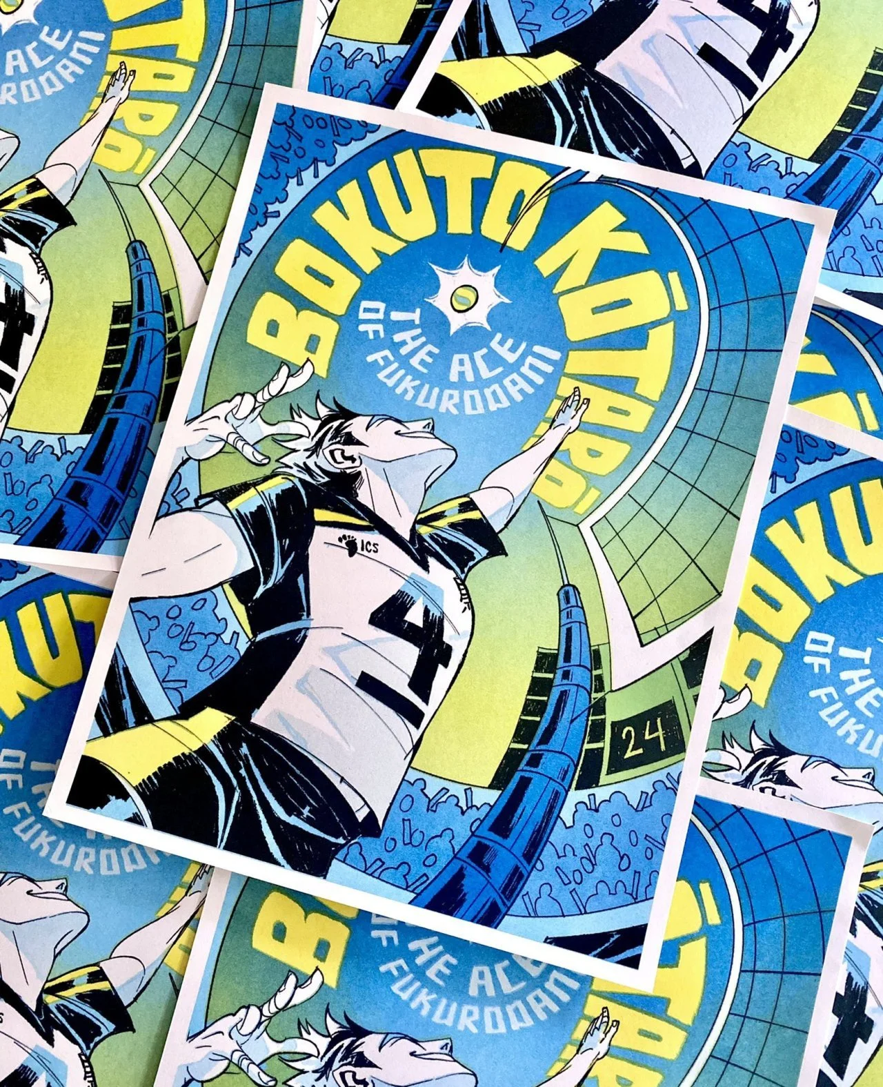
RISO prints are made with a Risograph printer. It looks like a photocopier, but works as a screenprinter; using vibrant spot colours and stencils to create prints in an affordable and eco-friendly manner using drums to push ink through rice paper stencils that the machine burns itself
The ink is best printed on uncoated paper which gives the final product it’s iconic risograph texture. Every color layer is printed one by one, so it let’s artists use rich and fluorescent inks colors that otherwise couldn’t be achieved with regular printers!
My Ink colors:
Black, Blue, Aqua, Mint, Yellow, Light Lime, Green, Flo Pink, Scarlet, Violet. Find the hex codes here.
Please let me know if you have any questions or need any help formatting!